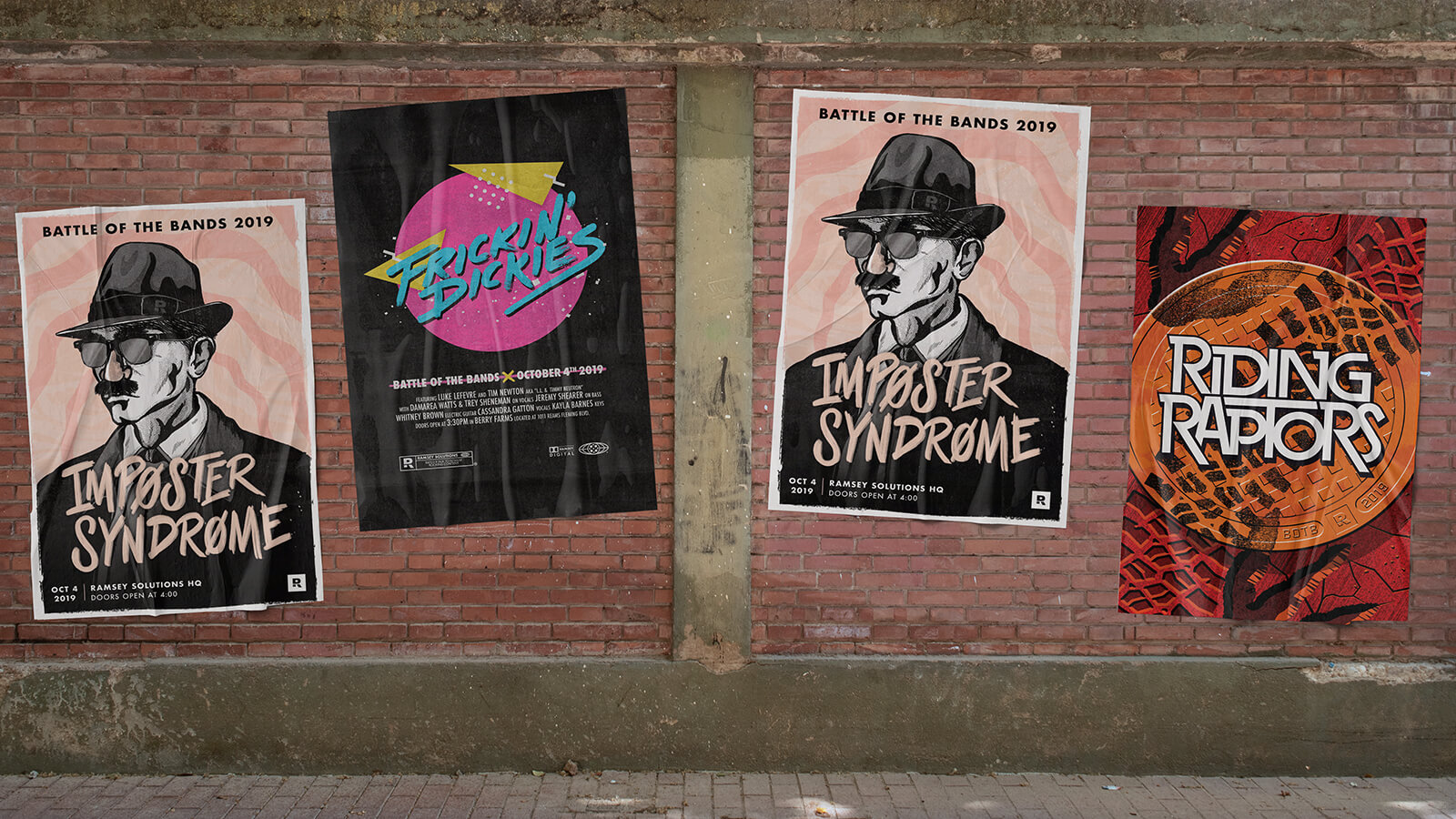
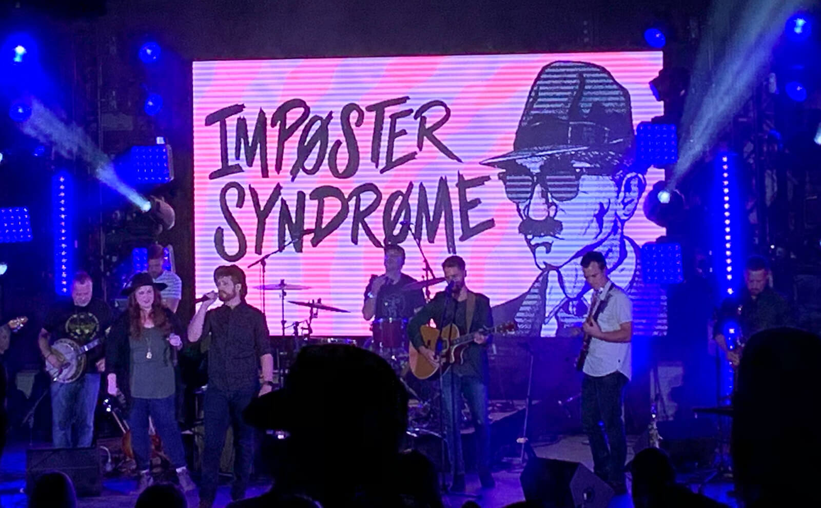
Battle of the Bands: Imposter Syndrome
Every year at Ramsey Solutions, they hold a Battle of the Bands competition, where 8-10 bands duke it out for pride, glory, cash, and a customized trophy. But what’s a great show without some killer posters? The only design rules are to avoid using photographs and to capture the spirit of the band you are tasked with representing.
- Digital Illustration
- Lettering & Typography
- Print Design
- Motion Graphics
Capturing the Vision
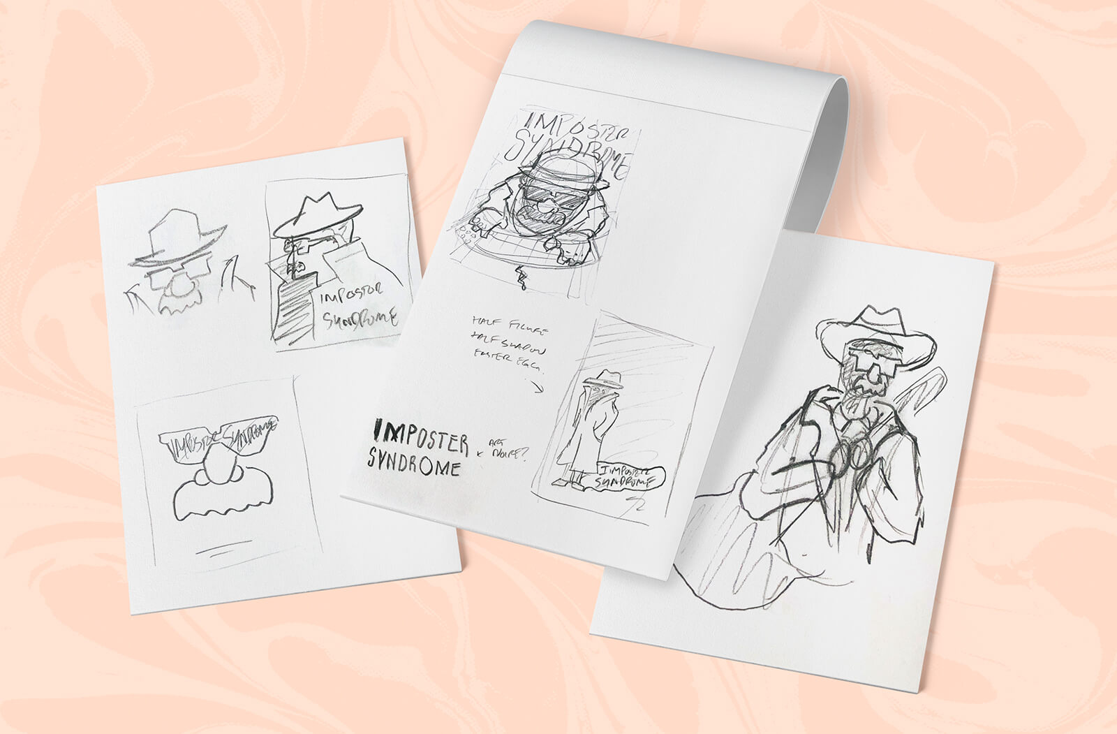
The band shared their vision of a man in a trench coat who embodied the vibe of an old spy movie. I liked the core idea and wanted to lean into stark, high-contrast, film noir-style imagery. I started with some initial designs that incorporated goofy fake glasses and a mustache, incorporating a comedic element and displaying the idea of an imposter.

Bringing the Poster to Life
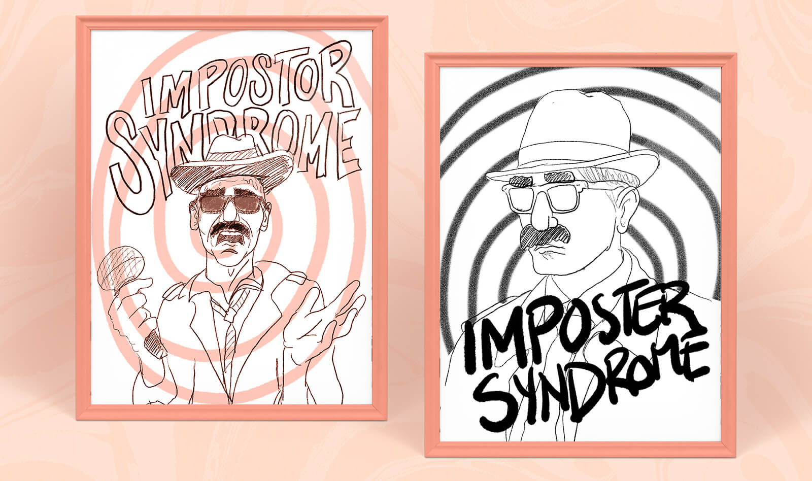
After working on some simple thumbnails, I drew the core idea in Procreate, blocking out lighting and shading. I wanted the subject to feel like an old comic book character, so I brought in a bunch of fun textures and illustrative lines.Once I was happy with the sketch, I brought it into Photoshop to clean up the coloring and digitally paint the halftone shading.
One of the feature songs the band intended to play was Pinball Wizard by The Who, so I brought in some funky colors and psychedelic textures to play off of the serious nature of the illustration. I rounded out the dominant gray tones with some peach colors and a rough, brushed treatment to pull everything together.
Setting the Tone with Custom Lettering
I wanted the type treatment to feel a little chaotic and scattered, like it was hand-written and scribbled hastily to indicate that the author wasn’t confident in what they were saying. Again, I was able to turn to Procreate to get the desired effect, which I added to the final assets.