Ping Pong-A-Thon
Ping Pong-A-Thon is a Melbourne-based organization focused on bringing freedom to the world’s most vulnerable in Southeast Asia because everyone deserves to live a life that is free. They help Australians and Americans alike engage their networks with fun, table tennis fundraising events that make a positive impact both in their communities and around the world.
A Rally Call to Renewed Vision
Every year, Ping Pong-A-Thon rallies global community around a central theme that drives the creative direction of their annual campaigns and unites people in the fight against human trafficking. After years of repurposing the same assets, they were ready to level up.
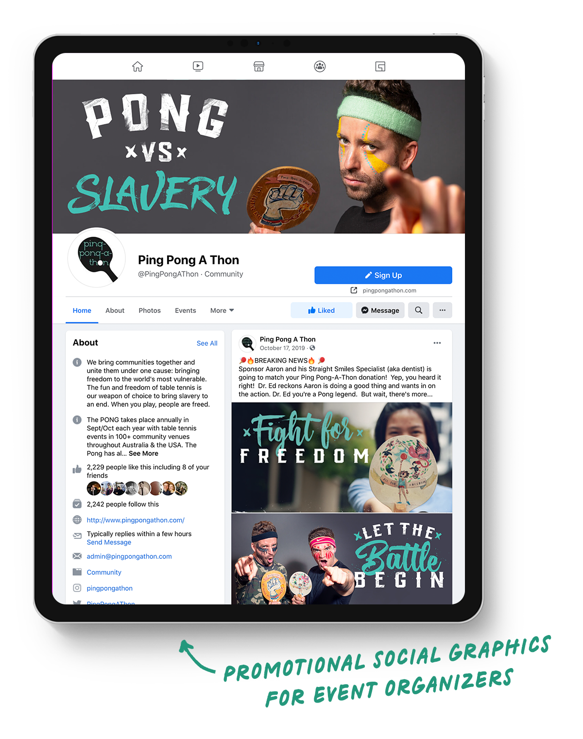
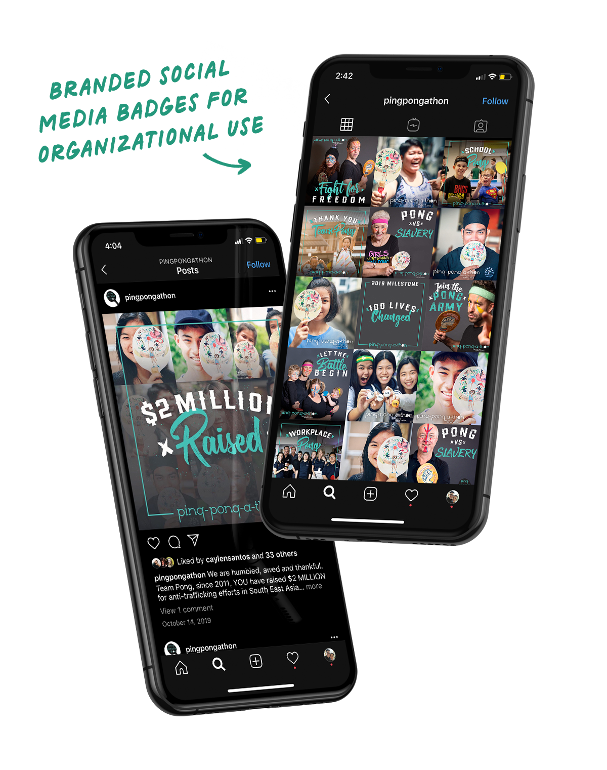
The Pong team needed their entire campaign suite updated. Together, we created a foundational marketing packet of print, digital, and social media assets they could provide to event organizers in order to build momentum and raise money for a good cause.
- Brand Strategy
- Verbal Identity
- Visual Identity
- Campaign Design
- Messaging & Copywriting
- Marketing Design
- Merch Design
- Digital Illustration
One Message. One Mission.
We knew from the jump that this campaign didn’t need clever. It needed clarity. Something strong enough to unite a scrappy group of fundraisers across two continents—and simple enough to be shouted across a gym at 2 a.m.
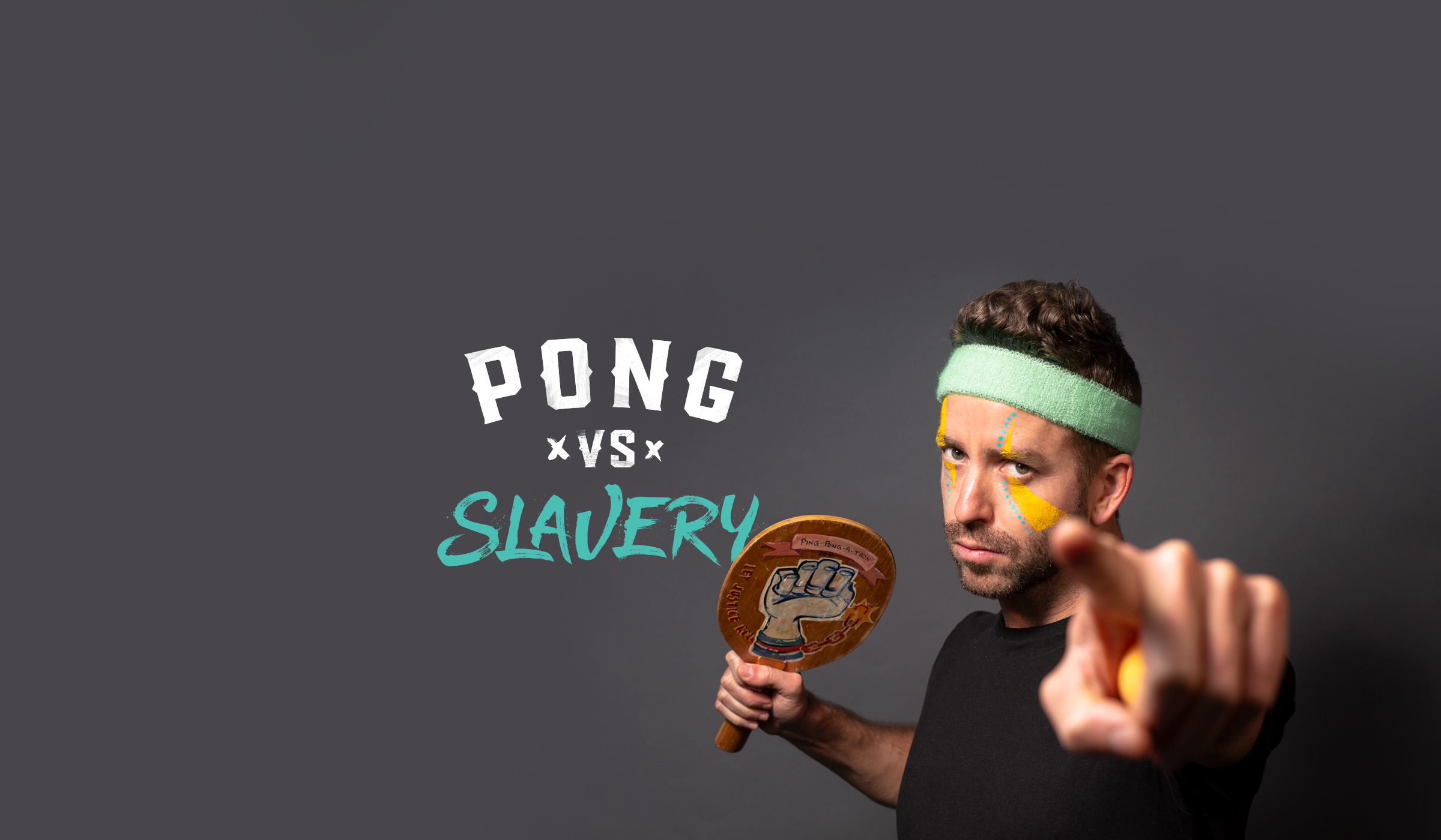
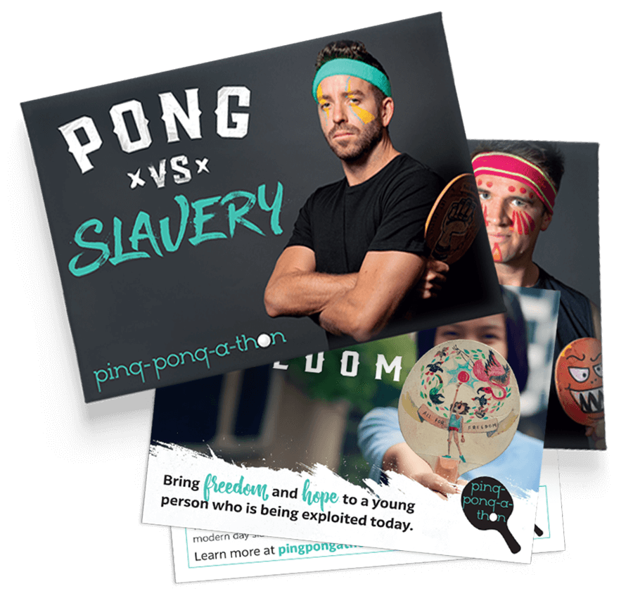
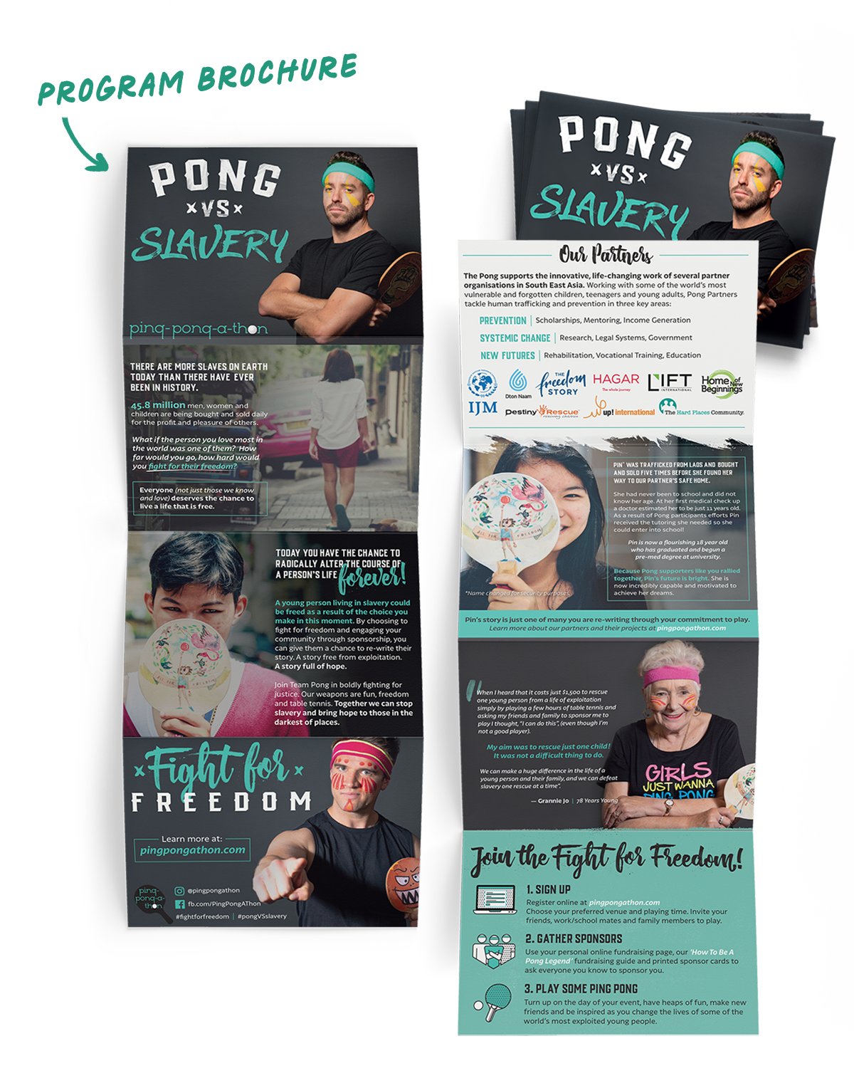
Pong vs. Slavery
It wasn't just a tagline—it was a call to arms. It united seasoned fundraisers and first-timers alike under one shared mission: freedom.
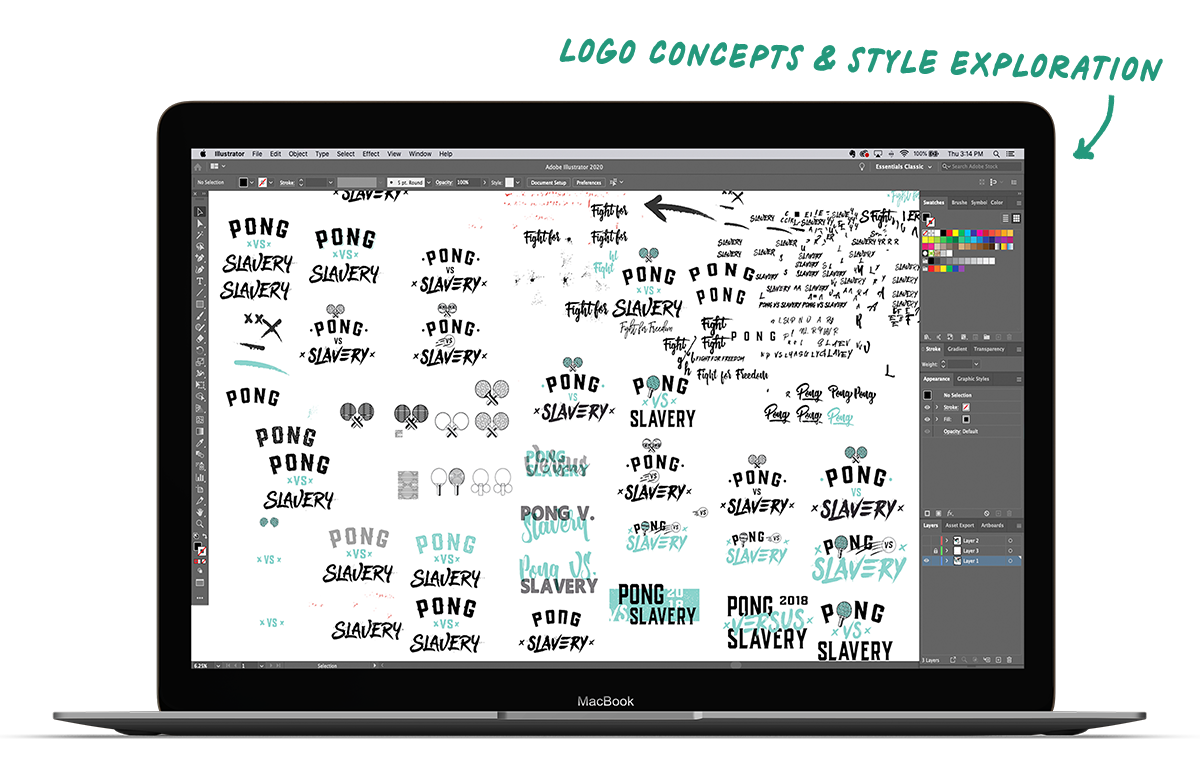
Once we had the message, the visual language had to carry that same weight. So we ditched the polish and went raw. With rough brushstrokes and custom lettering that felt like a fight, the final mark captured the energy of the events.
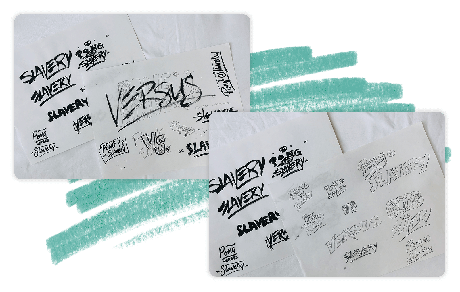
Ping Pong-A-Thon needed a battle cry. One phrase that cut through the noise, fired people up, and made it crystal clear: this isn’t just ping pong—it’s justice.
Creating a Cohesive Narrative That Sparks Action
The web design process began with a clear objective: to transform an outdated and confusing website into a cohesive, user-friendly experience that honored Shalom’s 20+ year history while looking forward to a future full of hope. Addressing the challenge of a cluttered and confusing site, we streamlined the navigation and overall structure to ensure a more intuitive user experience.

“Mitch is a legend!”
He distilled our (many) crazy ideas into designs that exceeded our expectations. He took time to understand our goals and our brand, and brilliantly reworked our messaging for our annual fundraising campaign so that every piece felt and sounded like us and smashed our results!
Matt Maudlin | Ping Pong-a-Thon
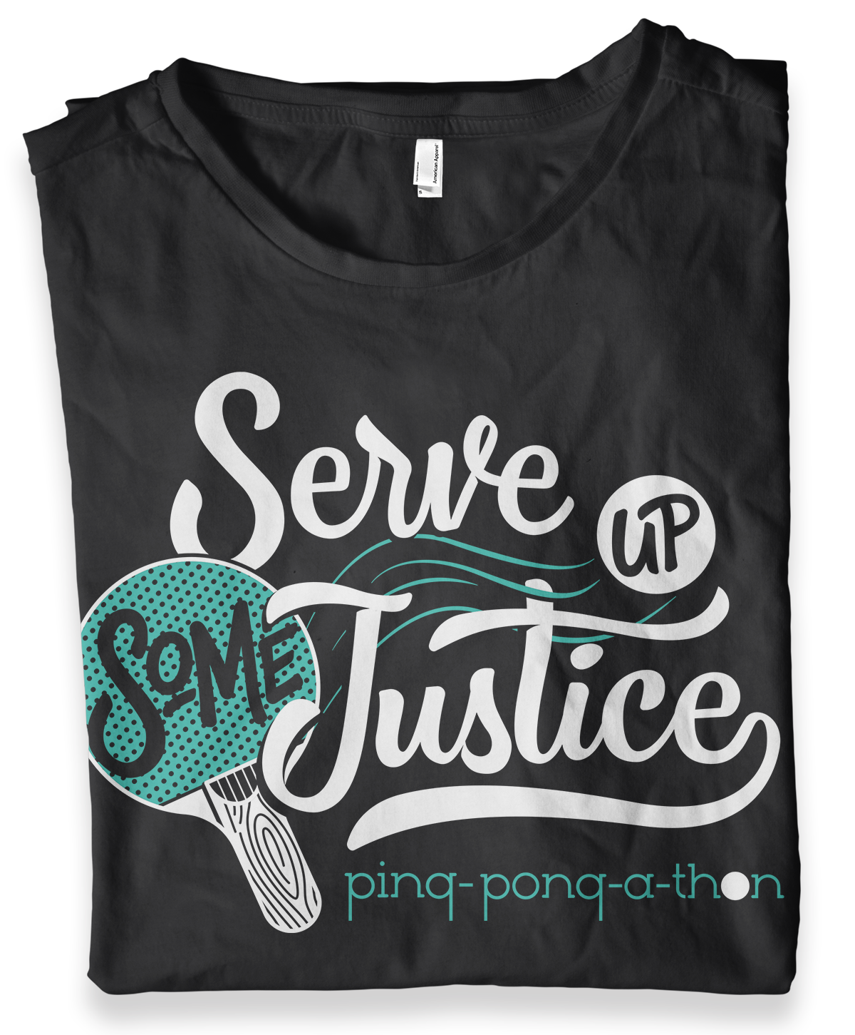
Merch With Purpose
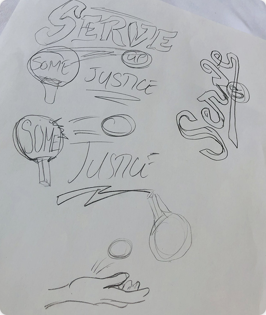
To rally more energy and unity behind the cause, we brought the campaign to custom apparel. Using one of our early (rejected but well-loved) logo sketches, we created a dual-tone "Serve Up Some Justice" illustrated slogan—designed to feel fresh, wearable, and aligned with the heart of the mission.
Hand-drawn elements gave it texture and movement, while refined vector work ensured it was clean and screen-print ready. It gave participants something they could wear proudly, and a simple way to carry the message beyond the gym.
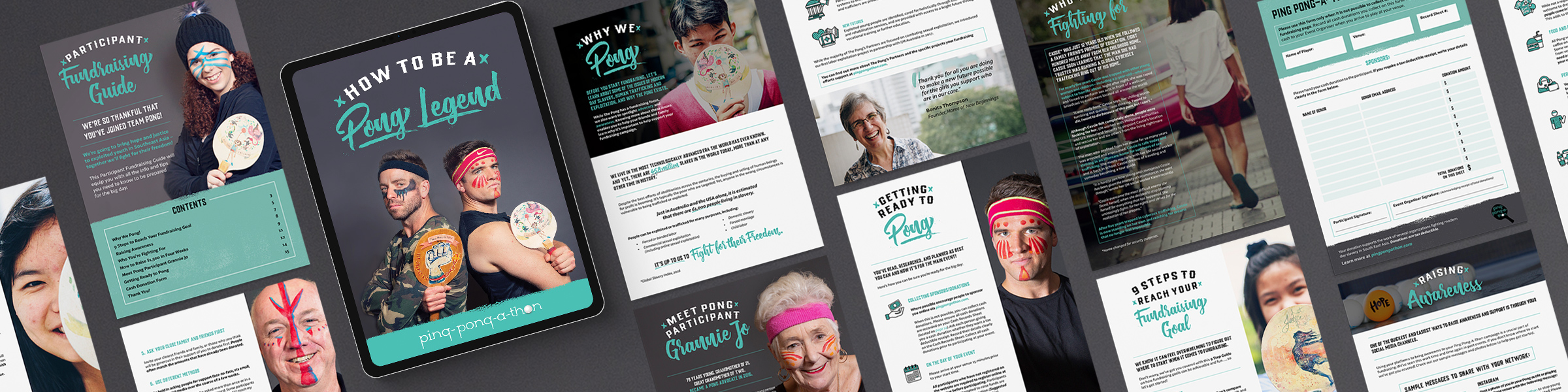
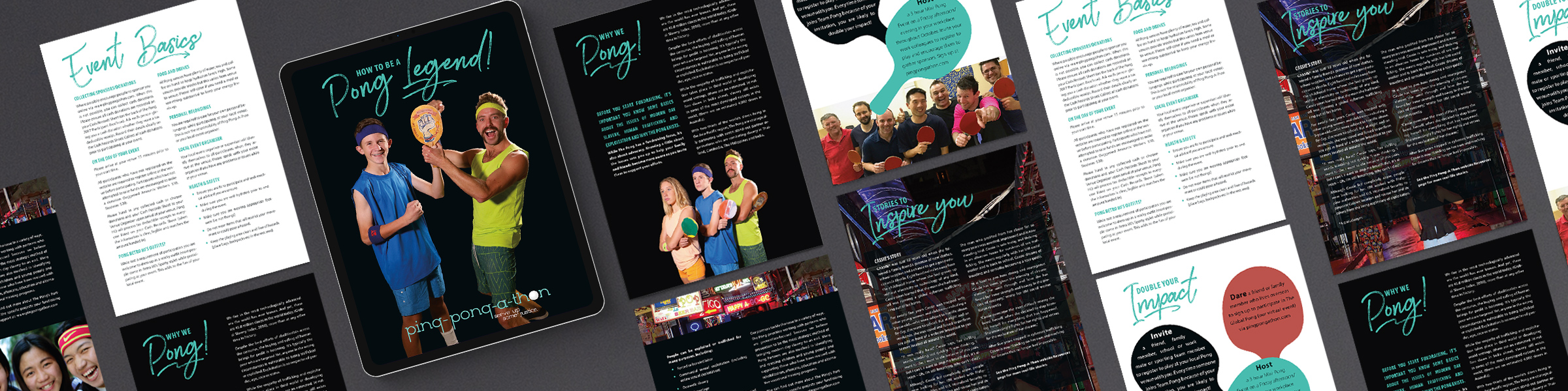
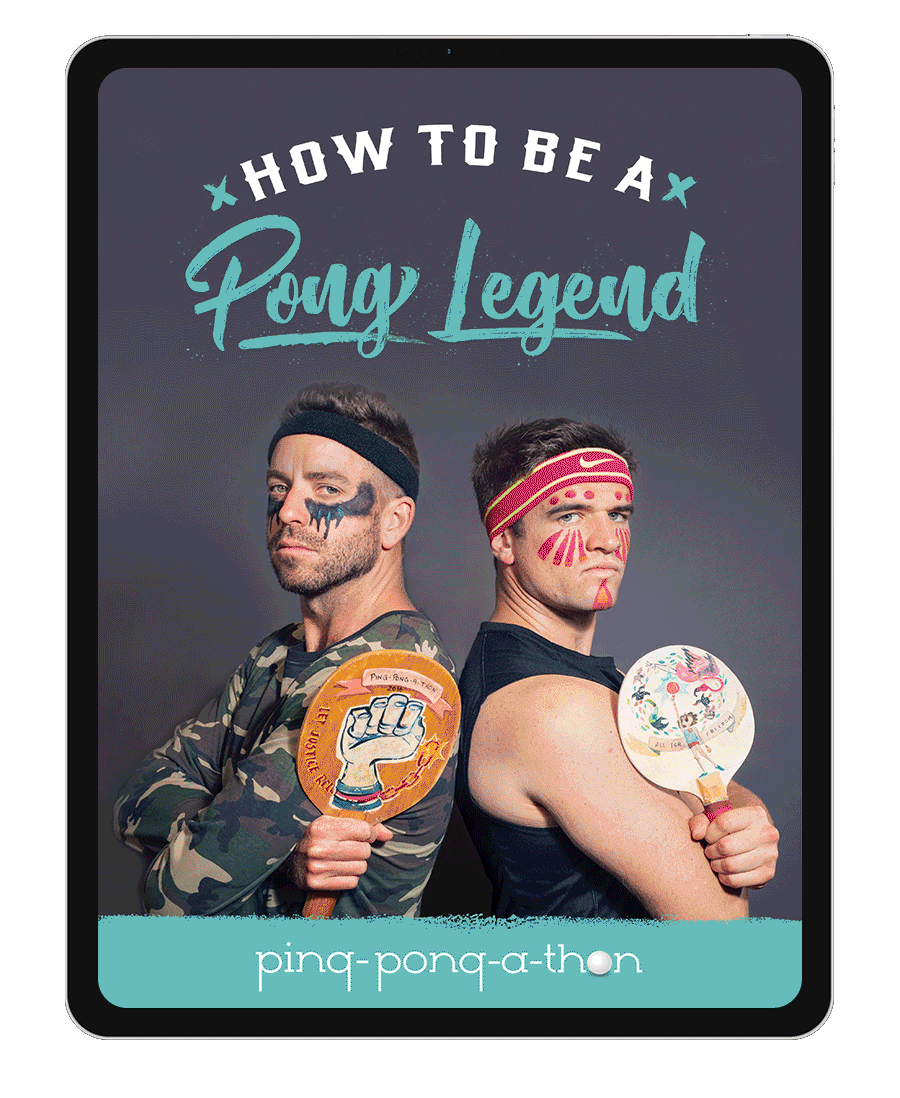
Clear Content That Changes Lives.
Strong campaigns don’t just look good, they speak clearly. So we helped Pong refine their voice and sharpen their message. While their older materials had heart, they were hard to follow. And as we zoomed out to look at the full content ecosystem, it was clear the messaging needed to be simplified across every touchpoint.
The first step was clarity around audience. In the past, campaign assets tried to speak to everyone—survivors, players, organizers, sponsors—which left the message confusing and diluted. After a series of content strategy workshops, we identified event organizers as the linchpin. They’re the ones bringing Pong into their communities, raising awareness, and rallying support. The campaign needed to speak directly to them.
We retooled the messaging to be easier to understand, easier to repeat, and more deeply connected to purpose. Clear action steps, simplified talking points, and stories of real impact helped organizers stay focused, inspired, and equipped.
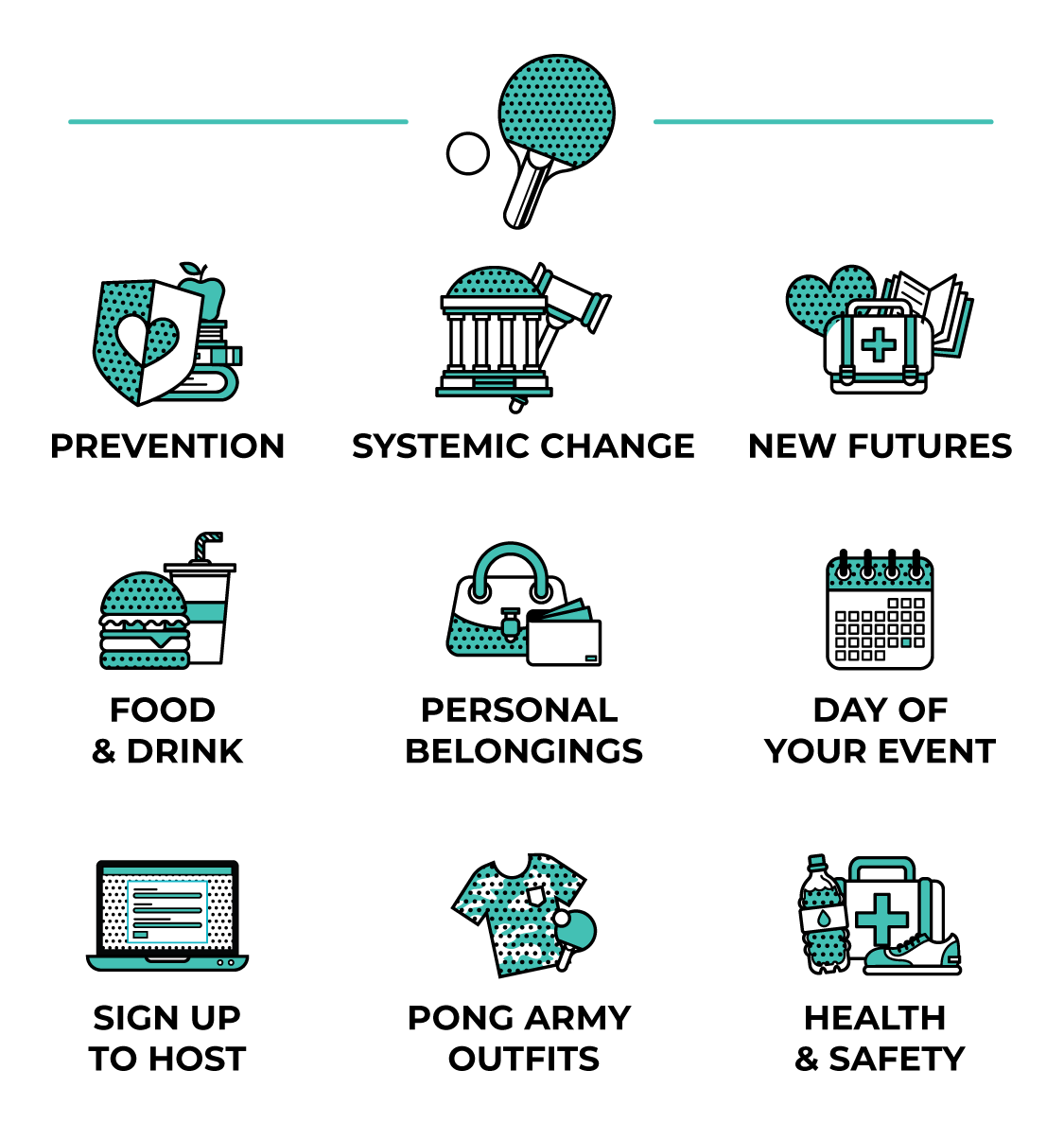
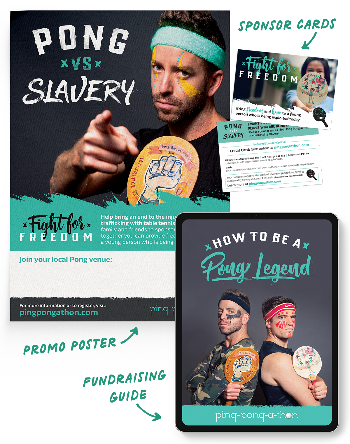
The fundraising guide was rebuilt as a digital PDF—clean, accessible, and loaded with links to promotional assets and tools. It became the central resource organizers could rely on to lead their events with confidence and clarity.